Flying W
LOGO & BRAND IDENTITY
This is a personal project I developed independently. I created this brand identity as a gift for my dad for Christmas. The "Flying W" was a name he had in his head for his own motorcycle brand. So I decided to put an image to the concept.
The Story
My dad spent his childhood in a garage in Hamilton, OH, building and detailing motor vehicles with his dad (my Paw-paw). This hobby grew into a passion as he matured, and continues to be a part of his life today. I do not know my dad without bikes; we joke that it's his "#1 love". Moving around and living in different houses, it has always been a priority to have garage space for his workbench and motorcycles, above all.
Paw-paw passed away in the summer of 2022. I think this prompted a new kind of spark in my dad to pursue this passion in honor of him. The "Flying W" serves as a symbol of the father-son bond that fuels the Wielinga men's spirit, carried in every project in their garage.
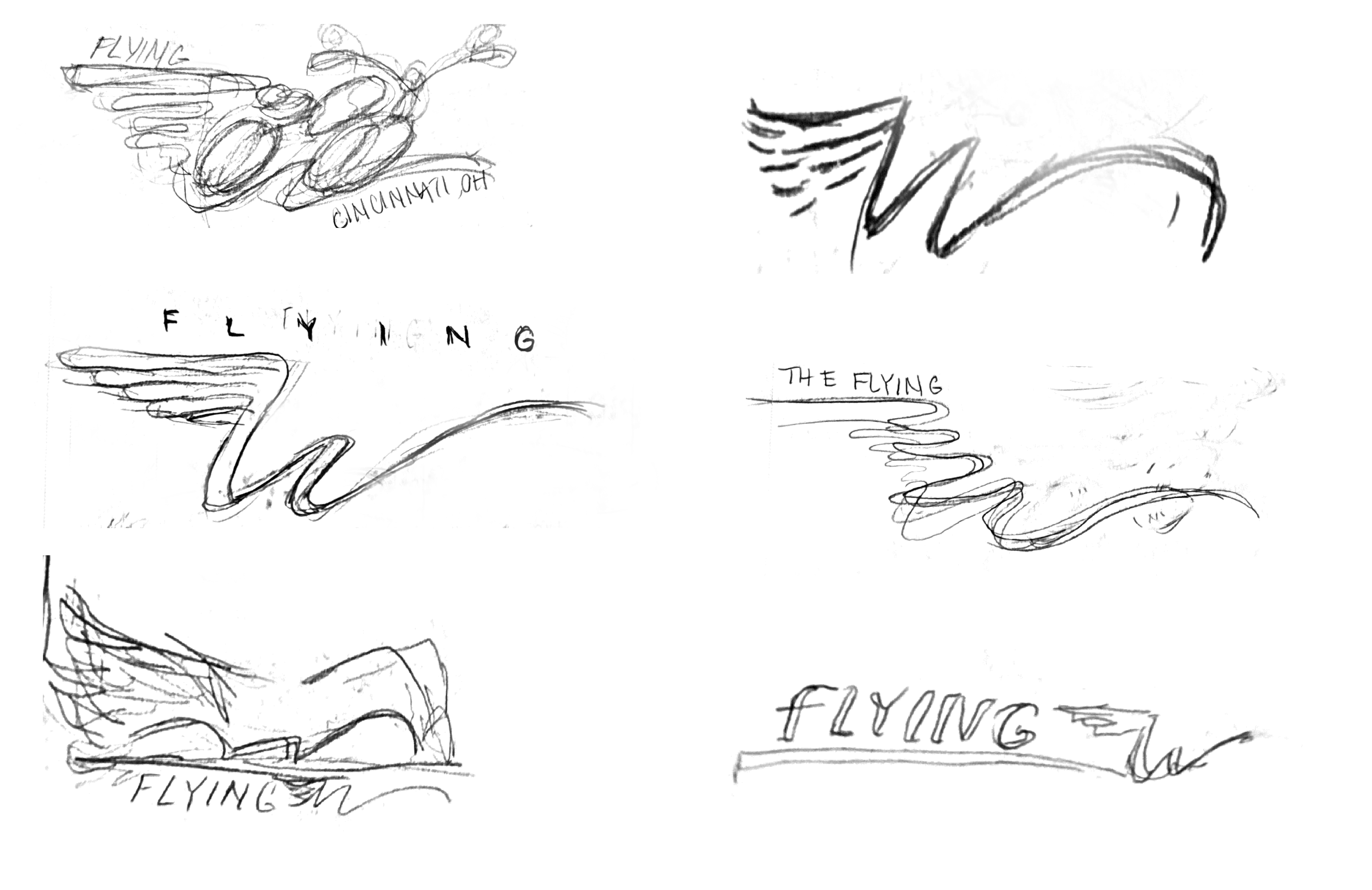
Concept Sketches
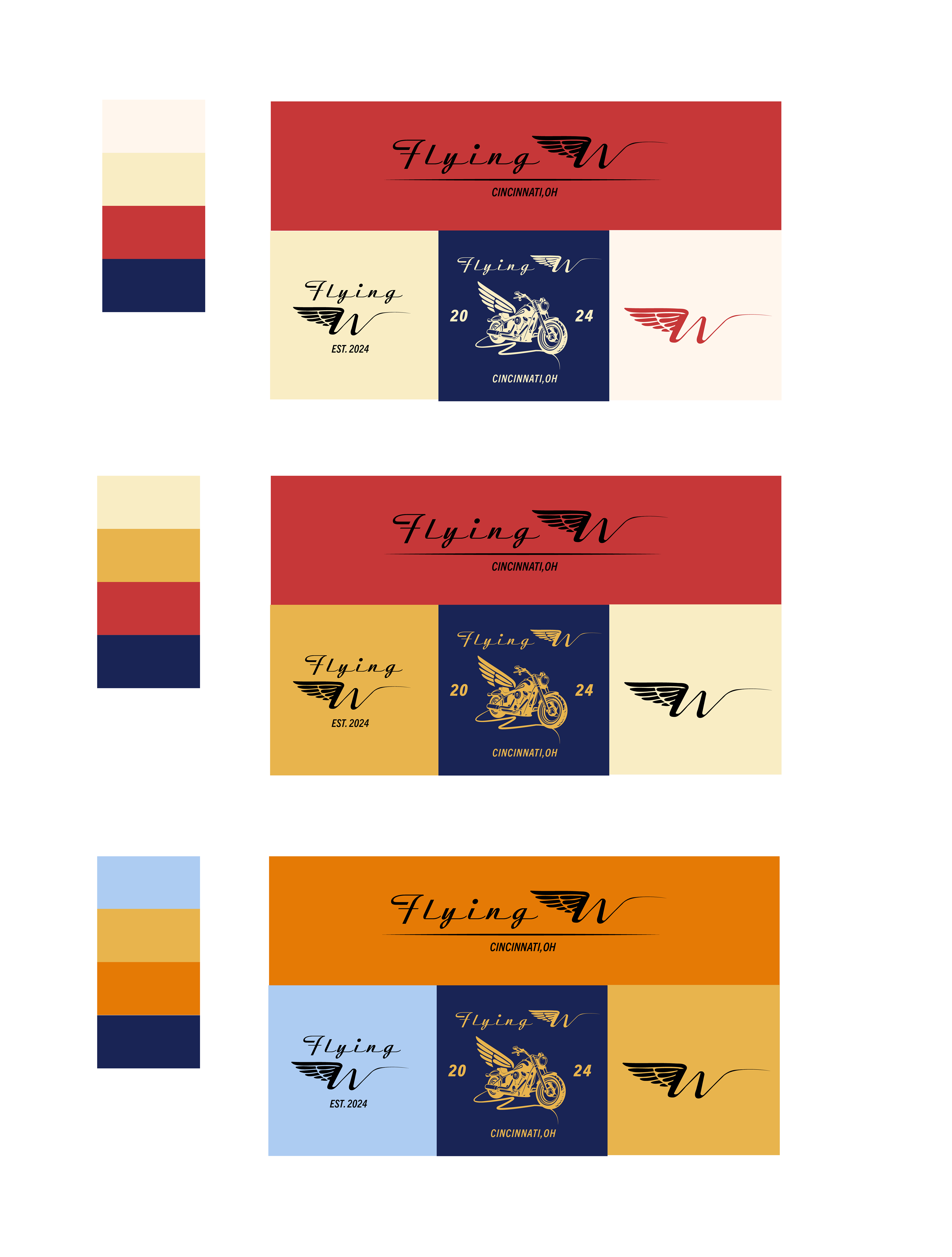
Being that my dad was born in 1969, many of the cars and bikes they worked on were from the 70s and 80s. I wanted this logo to evoke a vintage car logo with a sleek, modern feel.
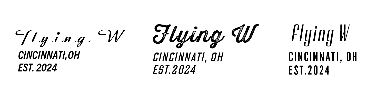
Typeface Studies
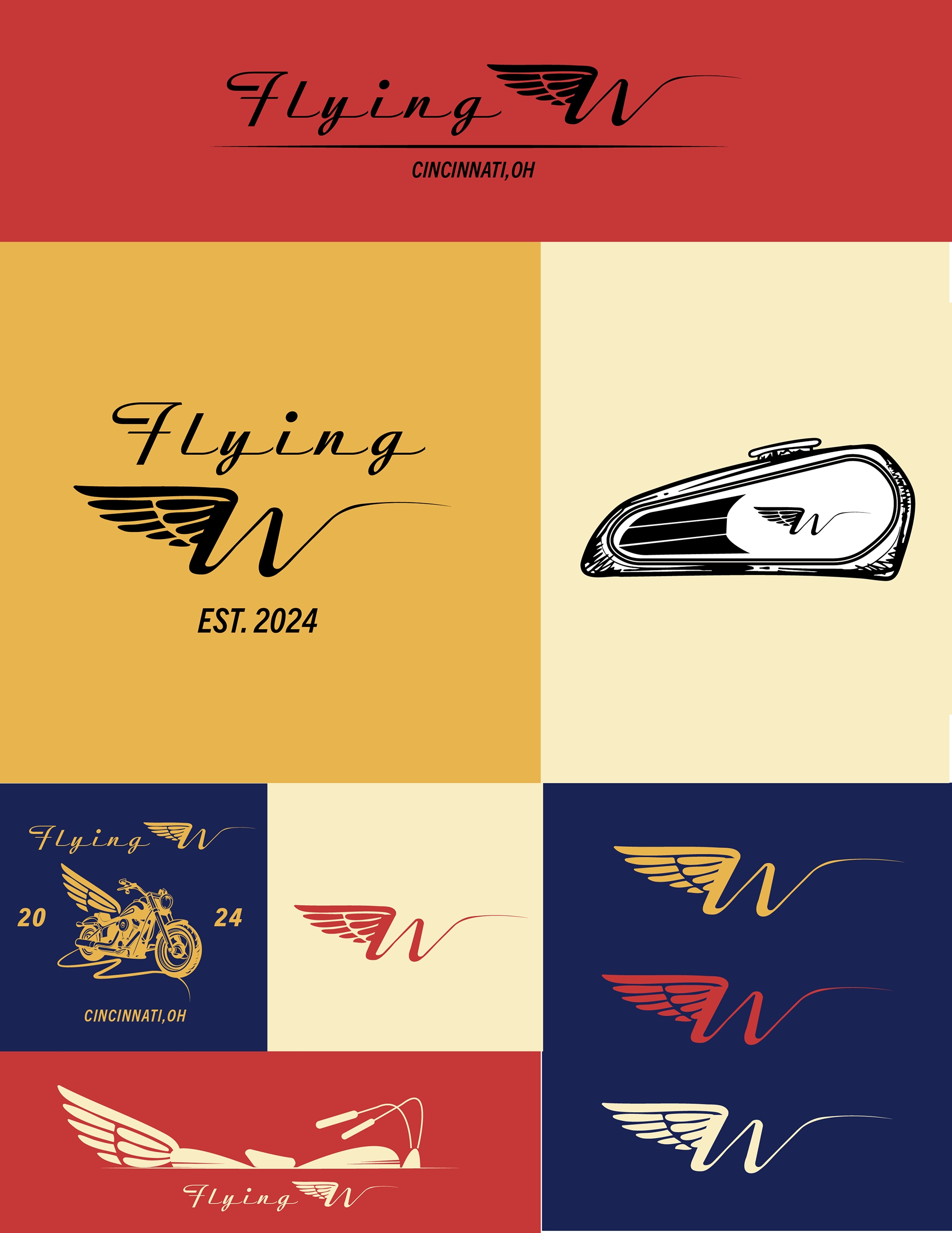
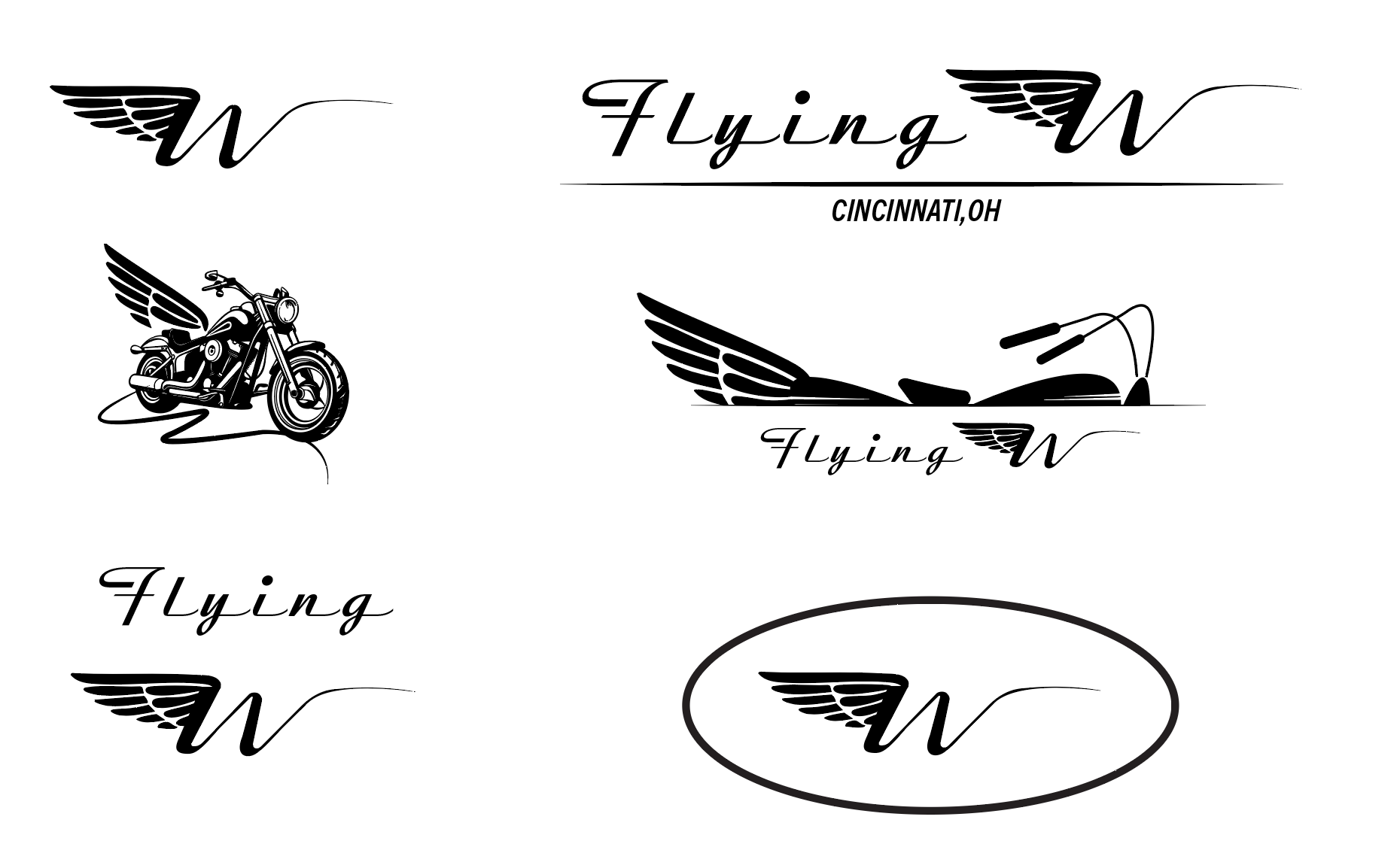
Digital Iterations
I generated digital iterations by combining the ideas from my sketches with my chosen typefaces.
Color Application
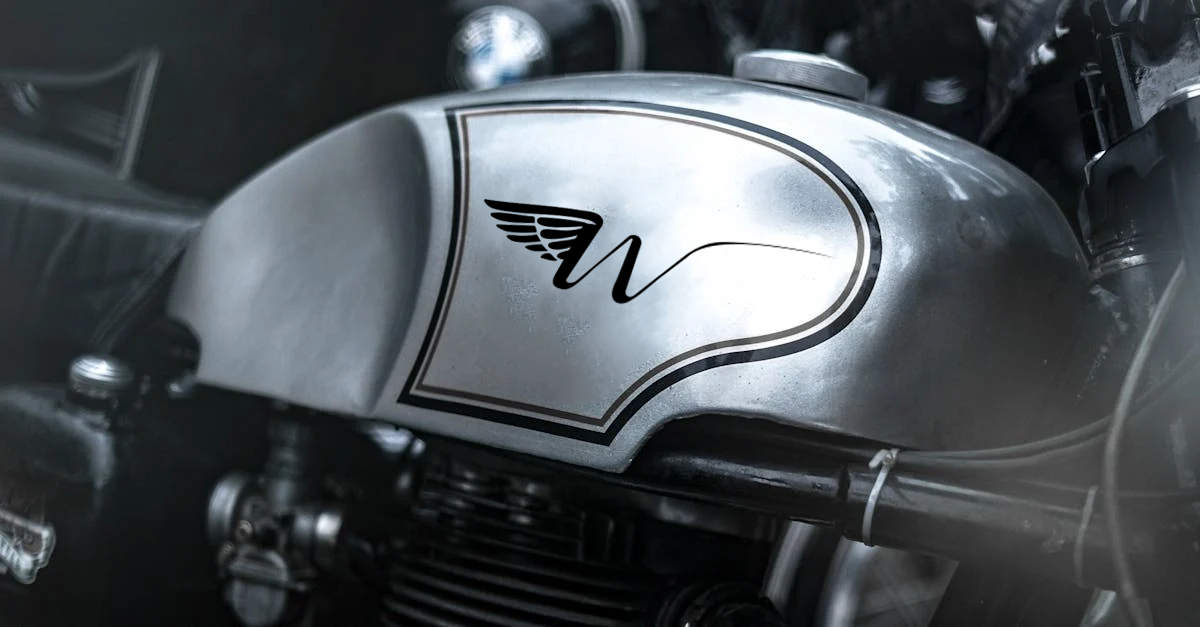
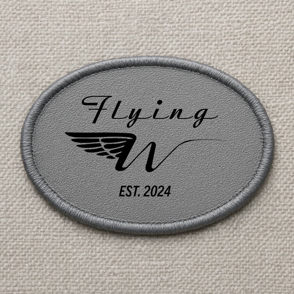
Final Brand and Logo